
Understanding of Typeface Styles and Classifications
- Tobin Thomas
- May 17, 2020
- 3 min read

Typography is one of the main mediums in the creative world, a good Typography can explore the designer's actual purpose to others, but it's a complex subject, because if we couldn't use the right typefaces in the right Places, our total designs went wrong. At the same time a clever graphic a designer knows how to use typography perfectly, but before that, a visualizer should know about the type of Typeface Styles and Classifications and it has a big history behind that.
Typefaces are classified according to the era in which they became popular or the design characteristics that made them stand out.
Blackletter Typeface
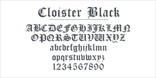
These types are also known as Textura, Gothic Script or Gothic minuscule. They were popular scripts in western Europe from the 12th to the 17th century. This type was introduced by Johannes Gutenberg
Examples of blackletter typeface
Roman Typeface

Roman is one of the three main kinds of historical type, alongside blackletter and italic. Roman type was modelled from a European scribal manuscript style of the 15th century, based on the pairing of inscriptional capitals used in ancient Rome with Carolingian minuscules developed in the Holy Roman Empire.This type was introduced by Nicholas Jenson in 15th century
Examples of Roman typeface
Bembo
Baskerville
Caslon
Times New Roman
Garamond
Italics

While roman typefaces are upright, italic typefaces slant to the right. ... Venetian printer Aldus Manutius and his type designer, Francesco Griffo are credited with creating the first italic typeface in late 15th century
Serif
A serif is a small shape or projection that appears at the beginning or end of a stroke on a letter. Typefaces with serifs are called serif typefaces. Serif fonts are classified as mainly 4 divisions
Old Style Serifs

This type was introduced by William Caslon in mid-18th century. This category is based on the first Roman types. It was estimated to have been used from the late 15th century up to the mid-18th century.
Old-Style serifs resemble writing in ink, with:
Low contrast between thick and thin strokes
Diagonal stress in the strokes
Slanted serifs on lower-case ascenders
Examples of Old Style Serifs typeface
Garamond
Goudy Oldstyle
Century Oldstyle,
Transitional Serifs

This type was introduced by John Baskerville, a notable English printer and typographer from the mid-18th century. Historically related to the rational spirit of the Enlightenment period, these fonts had hints of calligraphy but mostly relied on a bigger stroke contrast, stylized shapes with bracketed serifs and round, bulbous terminals.
Transitional serifs have:
High contrast between thick and thin strokes
Medium-High x-height
Vertical stress in the strokes
Bracketed serifs
Examples of Transitional Serifs typeface
Modern Serifs

These were born in the late 18th century. The Italian type designer Giambattista Bodoni is one of the most prominent figures related to this style type.
Didone or neoclassical serifs have:
Very high contrast between thick and thin strokes
Vertical stress in the strokes
“Ball” terminal strokes.
Examples of Modern Serifs typeface
Baskerville
Georgia
Times New Roman.
Slab serifs

This type was introduced in the early 19th century.
Slab serifs have:
Heavy serifs with imperceptible differences between the stroke weight
Minimal or no bracketing
Sans Serif
By the early 19th century typography had begun to outgrow the possibilities offered solely by serifs A typeface without serifs is called a sans serif typeface, from the French word “sans” that means "without." Sans serifs can divided in to 3 categories,
Grotesque Sans Serifs

Low contrast between thick and thin strokes, vertical or no observable stress
Examples of Grotesque Sans Serifs
Franklin Gothic
Helvetica
Monotype Grotesque
Geometric Sans Serif

They are constructed of conventional, monolinear lines and square or circular shapes. They are inspired by geometric shapes.
Examples of Geometric Sans Serif
Futura
Avant Garde
Avenir
ITC Bauhaus
Humanistic Sans Serif

Medium contrast between thick and thin strokes, slanted stress
Examples of Humanistic Sans Serif
Mentor Sans
ITC Goudy Sans
Optima.
Handwriting
Handwriting typefaces are unconventional with a natural, handwritten feel. These typically are used as H1 - H6 in your type scale. They come in the following forms:
Black letter
High contrast, narrow, with straight lines and angular curves
Formal Scripts

Replication of calligraphic styles of writing (more formal)
Handwriting

Replication of handwriting (less formal)
Thanks for reading!Resources for contents


Comments